The event was led by Associate Professor of Statistics Gregory Matthews and involved a presentation on his own interactions with art.
The event was led by Associate Professor of Statistics Gregory Matthews and involved a presentation on his own interactions with art.

Associate Professor of Statistics Gregory Matthews delivered a presentation on the influence of statistics in modern art and many of his data art projects, and he then held an interactive data art workshop.
The presentation and workshop occurred during the “Beyond Data Viz: Data Art” event, held on the fourth floor of the Information Commons Oct. 24.
Matthews said he chose to deliver this presentation because Loyola Libraries originally considered displaying a traveling art exhibit, which he said would’ve cost the library thousands of dollars.

Matthews, who has been creating statistical art since 2013, proposed his presentation to library staff because it would eliminate this cost.
The program was co-sponsored by the Department of Computer Science, the Department of Mathematics and Statistics and the University Friends of the Libraries program. The event was held in honor of National Friends of Libraries Week, which was created by the American Library Association in 2005 to express gratitude for library donors across the U.S.
Loyola’s Friends of Libraries group was established in 2009 to encourage donations to the library, which help increase access to resources, including books and items in Archives and Special Collections, according to the Friends of the Libraries’ website. The donations also support the setup and sponsorship of events, such as the Data Art presentation.
Beyond supporting Loyola Libraries, Matthews said the event aligns with Loyola’s Jesuit philosophy of interdisciplinary learning opportunities.
“The idea of being a liberal arts institution like the College of Arts and Sciences is a sort of well rounded education,” Matthews said. “That’s sort of the foundation of Jesuit education. And I think [data art is] an interesting topic because you’re blending together something that is very much in the humanities and something that is very much in the STEM world.”
Matthews first discussed how his opinions about art have changed over time. He said he used to hold a narrow view of art and thought about it as simply “paint on a canvas.” Matthews said his wife, who completed her bachelor’s degree in art, exposed Matthews to wider varieties of art forms via trips to museums.

“Art was never presented to me in a way that was accessible to me as a person who liked numbers,” Matthews said. “It was either you’re good at science or you’re good at art, and there’s no in between. And that’s kind of a ridiculous way to present it to people.”
Matthews said he thinks data is meant to be intertwined with art considering the importance of the historical and societal context.
“Because of the world we live in, data art was inevitable to happen because everything is data,” Matthews said. “Everything you do, every email, every search you make, is being tracked. It’s just generating data. And art reflects the world in which you live, and the world in which you live is dominated by data. And so I think it’s sort of a natural pairing.”
After his argument on the inevitably of data art, Matthews displayed some of the pieces of data art he has created since he began his work in 2013. Many of these pieces are currently on display on the first floor of Cudahy Library.
One work Matthews displayed is Jason Salavon’s “The Top Grossing Film of All Time.” Matthews explained Salavon’s work was created using computer software by digitizing the 1997 movie “Titanic” and using coding to assign each frame of the movie to one pixel of the screen.
Then, more codes were written to make the color of each pixel the average color of the corresponding movie frame, creating a visual that follows the chronology of the movie from left to right and top to bottom.

Matthews first saw “The Top Grossing Film of All Time” at the Art Institute of Chicago, where it was on display in the Thorne Miniature Rooms exhibit. The piece immediately stood out to him as an especially creative artistic data visualization.
“I go to the art museum, and I never think ‘Oh, I want to go see that,’” Matthews said. “I just kind of wander around. But this particular one, for whatever reason, I said, ‘I’m going to go see what that is.’ I read about it, and I was even more excited about it when I saw it. That’s incredible data art in my mind.”
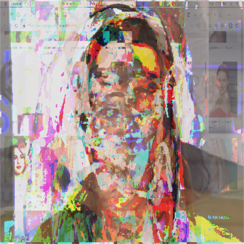
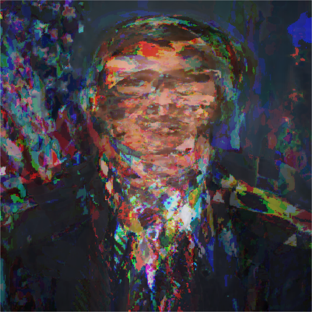
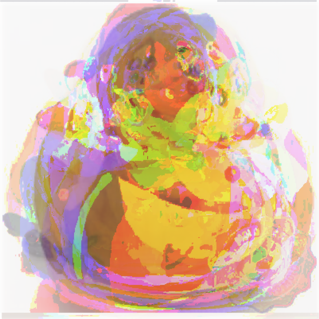
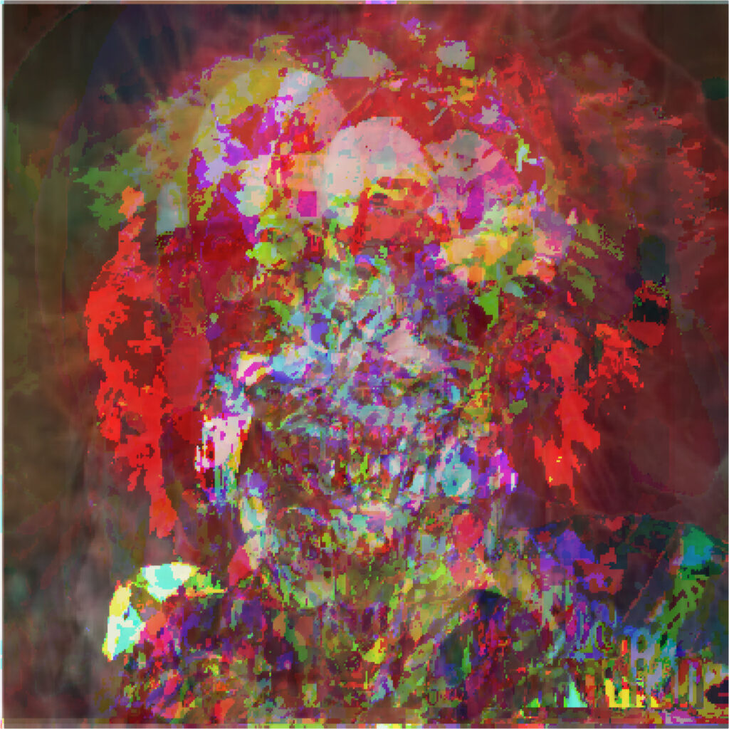
Matthews also displayed five images he generated, with coding software and AI, based on the results of Google image searches. These five works, titled “Clown”, “Celebrity”, “Rubber Duck”, “Idea”, and “Senator”, constitute Matthews’ Google Image Search Series.
Third-year Data Science major Josie Peterburs, one of the program attendees, said Matthews delivered the same presentation during her Intro to Data Science class during the spring semester of her freshman year.

Peterburs said she remembers seeing the works in Matthews’ Google Image Search Series both times she saw Matthews’ presentation. However, she was most surprised by how ubiquitous data art is throughout the world.
“There were examples that he showed that I did not realize would be considered data art, but they were interesting and conveyed a message using data,” Peterburs said. “I had only known about data art because of Dr. Matthews, and I think it is a super cool thing to learn about.”
Matthews said data art differs from data visualization because the latter mostly serves to pictorially summarize data for informational purposes, such as with graphs or charts. In contrast, data art values aesthetics and exists to incite an emotional reaction and deep thought in its viewers.
“Really successful art would make them think about stuff. Like, I would like people to think about ‘are you comfortable with all the data that is being collected on you by private companies or corporations?’” Matthews said.
Near the conclusion of the event, Matthews taught attendees how to create their own data art using R, a computer programming language used for data analysis, by modifying a piece he had already created. By copying Matthews’ codes for the piece, attendees could alter the shapes, sizes, colors and line thicknesses of elements in the piece.
The event was mostly attended by undergraduate and graduate statistics, data science and computer science majors, including fourth-year data science major Samantha Fleming.

Fleming said she has taken several of the data science and computer sciences classes taught by Matthews and listened to him deliver the same presentation on data art during her Intro to Data Science class.
Fleming said she has always been interested in art but fell in love with data science during her second year during an analysis of a dataset in one of her classes. The class explored a baby names dataset to figure out the most common unisex baby name, she said.
“You can’t do that by tallying because you’re trying to find the intersection between the one that’s used the most but also the most evenly across sexes,” Fleming said. “It was Ocean, and that blew my mind, because you can’t find that through tallying. You need to actually study data, get into it, and it really opened my mind.”
Overall, Matthews’ presentation emphasized the impact of data art as an art form.
“Good art can change the world in a way that an academic paper is not going to,” Matthews said. “I think you can make people think about questions and reflect on deep questions with art much more easily than with academic papers and academic work. So that’s why I think art is important and data art is important.”

Justin Peabody is a second-year student from Arlington Heights, IL majoring in data science and minoring in environmental science. This is his second year as a staff writer. He’s written about campus sustainability and climate action initiatives, invasive lady beetles, and much more. In his free time, he enjoys reading and an occasional video game.